
Maddie Lander| Writer
September 28, 2025
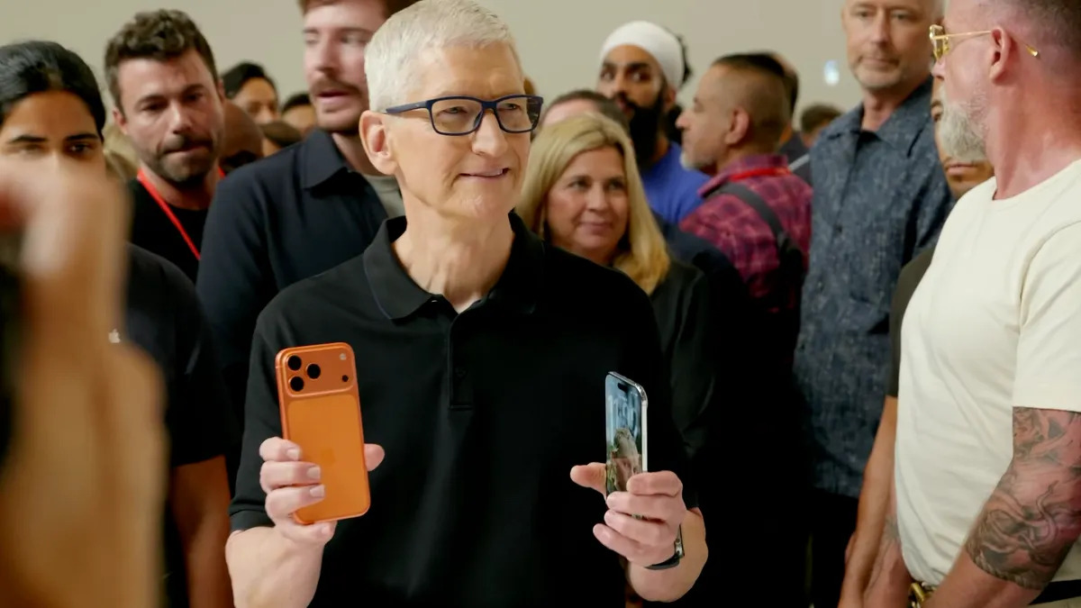
On Tuesday, September 9, 2025, Apple released the new iPhone 17 line at their jaw-dropping event where expectations were sky-high. Apple has been known for their clean and modern design which encourages individuals to purchase their product. Unfortunately for Apple, their new iPhone 17 Pro models caused a switch up in customer opinions. What used to be the popular and a crowd-pleasing design is now getting criticized for its hideous appearance.
Prior to the event, many of the new iPhone 17 features and design leaks had already circulated. By launch day, the excitement subsided and without a major surprise, the event lacked the catalyst it was looking for. Following the announcement, Apple experienced a 1.5% decline in their stocks. Underwhelmed investors decided to pull their investments, contributing to this decrease.
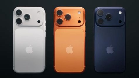
The two iPhone 17 Pro models feature a new rear camera design which Apple refers to as the “camera plateau.” This new design includes a camera that stretches across the top third portion of the phone instead of the smaller camera from years prior that only took up the top left corner. This new camera plateau dominates the phone’s look and produces a blocky and bulky appearance. The camera section on the rear is also a completely different finish than the rest of the phone. It doesn’t fade into the rest of the design, making it even more of an eye sore. Sophomore student Elle Huntington mentioned that “it looks like an Android because of the huge camera.” Apple has completely shifted from its original, easily identifiable, sleek and modern design to an unrecognizable one. The company has put themselves in jeopardy, especially in regards to the new rear camera design.
Additionally, this year, Apple’s Pro models only come in three colors: silver, deep blue, and a bright cosmic orange. In all past years, Apple’s Pro models came in a dark gray or black, but this year both of these colors are not offered. This is extremely alarming to many iPhone users who expect to order a dark phone because deep blue is now their only option. Additionally, cosmic orange is particularly strange in the array of colors. Sophomore Rebecca Supran thought that “the bright orange color throws off the color scheme.” The silver and deep blue finishes receive mild praise, but the orange throws off the balance. It looks fun and different, but it feels out of place and should not have displaced either a dark gray or black color.
Design decisions, particularly ones that change how the back portion of the phone appears and cutting classic color options, upset many Apple users. For a brand with high prestige, these mistakes can sting. Whether this dissatisfaction translates to a drop in sales or stocks, Apple will sustain the financial consequences and backlash from customers and investors.
Leave a Reply